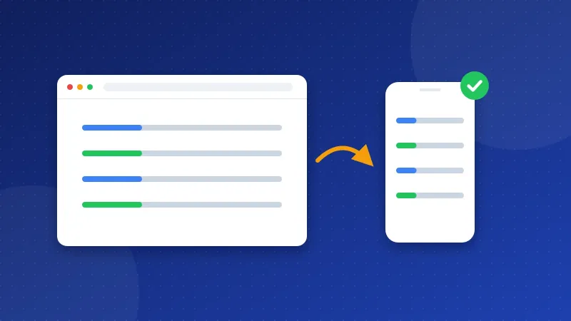
The viewport meta tag is one line in your page head that tells phones how wide to draw your page. Without it, a phone draws a desktop-size page and shrinks it, so the text looks tiny. Add <meta name="viewport" content="width=device-width, initial-scale=1"> to the head of every page, and do not block zoom.
The Website SEO Checkup groups this tag with a few other mobile and page-head checks: media queries, zoom, the lang attribute, the charset tag and old HTML tags. This guide fixes all of them.
Why does mobile matter for Google?
Google says it uses the mobile version of your content, crawled with a smartphone crawler, for indexing and ranking. A crawler is the robot that reads pages for a search engine. So the way your site looks on a phone is the way Google judges it.
Many of your visitors read on phones too. If they have to pinch and zoom to read, many leave and pick the next result.
What does the viewport meta tag do?
The viewport is the visible area of the page on the screen. Phones have small screens, but older websites were built for wide desktop screens. To cope, mobile browsers pretend the screen is much wider. Web.dev says they draw the page at about 980 pixels wide and then shrink it to fit. Text becomes tiny and buttons are hard to tap.
The viewport meta tag stops that. It has two parts:
width=device-widthmakes the page as wide as the phone screen.initial-scale=1starts the page at normal size, at 100% zoom.
The tag alone does not make a page mobile friendly. It tells the phone to show the real width. Your CSS then has to fit the content into that width.
How do you add the viewport tag?
Place it inside the head section of every page, near the top. Pick your setup:
- Bloghints CMS: the theme already includes it. If the checkup still flags it, check for a custom head code box that adds a second, broken tag.
- WordPress: almost every modern theme adds it. If yours does not, the theme is very old. Switch to a responsive theme, which is a theme built to fit every screen size.
- PHP site with includes: open your shared header file, often header.php or head.php. Paste the tag after the charset line and before the title.
- Plain HTML site: paste it into the head of each page, or move your head into one include file first so you only change it once.
The Meta Tag Generator writes the viewport, charset, title and description tags for you in one go, ready to paste.
Why should you never block zoom?
Some old themes add user-scalable=no or maximum-scale=1 to the viewport tag. Both stop visitors from zooming in. That hurts people with poor eyesight. MDN notes that the accessibility rules known as WCAG ask for at least 2x zoom, and that 5x is best practice.
The checkup flags this as the zoom problem. The fix is to delete those two parts so the tag reads exactly like the line in the first paragraph. If your layout breaks when people zoom, fix the layout, not the zoom.
What are media queries?
Media queries are CSS rules that apply only on certain screen sizes. They let one page change its layout on a phone, for example by stacking two columns into one. Here is a simple one for your style sheet:
@media (max-width: 600px) { .sidebar { display: none; } .content { width: 100%; } }
This rule hides the sidebar and widens the main text on screens 600 pixels wide or less. Web.dev suggests you choose breakpoints where your content starts to look bad, not by phone brand. A breakpoint is the width at which the layout changes.
If your theme has no media queries at all, the checkup flags it. The easy fix is a responsive theme. On a hand-made site, add a few rules like the one above, starting with the main content, images and menu. Also add img { max-width: 100%; height: auto; } to your CSS so images never overflow the screen.
How do you fix lang, charset and old tags?
These checks sit in the same part of the report because they all live in your page head or HTML:
- Lang: the lang attribute tells screen readers and translation tools which language the page uses. Write your opening html tag as
<html lang="en">, or use your own language code, such as "id" for Indonesian. - Charset: the charset tag tells the browser how to read letters and symbols. Without it, quotes and accents can turn into odd signs. Make
<meta charset="utf-8">the first tag in the head. - Deprecated tags: deprecated means old and no longer supported. Tags like font and center belong to old HTML. Replace them with CSS, for example
text-align: center;instead of the center tag.
Put together, the top of a clean page head looks like this, one line after another:
<html lang="en"><head><meta charset="utf-8"><meta name="viewport" content="width=device-width, initial-scale=1"><title>Your Page Title</title>
How do you check that your site works on phones?
- Open your page in Chrome, press F12 and click the phone icon at the top of DevTools. Pick a small phone and reload.
- Scroll the page. The text should be readable without zoom, and nothing should scroll sideways.
- Pinch to zoom on a real phone. It should work.
- Run PageSpeed Insights on the mobile tab. It also warns about a missing viewport tag.
A mobile-friendly page also loads fast on a phone. Our guide to Core Web Vitals for beginners covers speed, and image SEO for beginners shows how to size images for small screens.
Add the viewport meta tag, let people zoom, and use media queries so your layout fits small screens. When the changes are live, re-run the free Website SEO Checkup to confirm the mobile checks pass.
Frequently asked questions
Can I have two viewport tags on one page?
You should not. Browsers may use the wrong one, and the checkup may read the broken copy. Search your page source for "viewport" and keep only one tag with width=device-width.
Is initial-scale=1 required?
MDN says width=device-width is the key part and that initial-scale=1 is often not needed. Most sites still add it, because it makes the page start at normal size on every phone. It does no harm, so keep it.
Does the viewport tag make my site responsive on its own?
No. It only tells the phone to use its real width. Your CSS still has to fit the content, with media queries, flexible widths and images that shrink. A responsive theme handles both parts for you.